Bootstrap 4 Display 유틸리티 - table columns 을 hide 처리하기
Bootstrap 4을 사용을 시도해 보고 있는데,
Utilites > Dispaly 를 이용해서, responsive display의 hide 처리를 할 수 있는 propety가 있어서,
<table>태그에 <th>,<td>에 .d-lg-block을 사용해 보려고 했답니다.
[ .d-none .d-lg-block 을 사용 했을때, 테이블 깨지는 현상 발생 ]
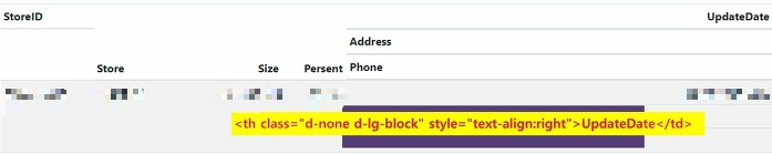
테이블에 사용할때면, 이상하게 컬럼이 밀리고 깨는지는 형상이 났습니다.
(원인은, .d-lg-block을 줬던 부분의 객체가 block형태로 변화되어서, 라인전체를 차지하려고 하기에 발생하는 현상입니다.)
알고 보니. d-lg-block은 block/inline 타입인 <div>, <span>과 같은 요소에서만 사용을 하였더군요.
(참고: https://getbootstrap.com/docs/4.1/utilities/display/#notation )
테이블의 th, td의 경우는 다음과 같이 사용해야 합니다. (이걸 몰라, 몇일을 고생했네요. ㅠ_ㅠ;;)
.d-none .d-sm-table-cell
d-{breakpoint}-{value}
breakpoint: sm, md, lg, xl
value: block, table-cell 등
Display utility classes that apply to all breakpoints, from As such, the classes are named using the format:
Where value is one of:
The media queries effect screen widths with the given breakpoint or larger. For example, |
참고: https://stackoverflow.com/questions/48292516/hide-table-columns-using-bootstrap-4
참고2: (한글) https://code.i-harness.com/ko/docs/bootstrap~4/utilities/display/index